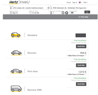
KRFL Hertz Icons website

Creating icons for web
Things to remember when developing pictograms.
I noticed that sometimes misunderstandings pop up during briefings. Should I do things as fast as possible or really dig deep and do it perfect. To do both would be perfect but sometimes I overlook things. To work for a few hours here and there, working with files others have worked on makes it hard. So I need a list, what has been checked and what has not been checked?
Things that go wrong for instance, sketches send off for approval do not get finalised because somebody else exports them and overlooks that they are not finalised yet. The client director just asks for the eps files and does not know that the files are not ready. If the concept is approved there is still some work that needs to be done.
I do not know the procedure for every company I work for. That is why I would like an idiot proof checklist. Handy for client managers, to accompany their briefings and to make sure every free lancer is on the same page. Has the right file at hand (The open file that is not outlined yet) You can run through the options and make sure you check what needs to be done. I made one for the icon designs for Hertz. Please clients check with your AD or CD if you work with freelancers it will save you a lot of time. And organise a workshop for your freelancers so they know where to find things when you book them.
HERTZ
The briefing was to develop icons for the new website. They had to be in the same style as some icons they already had. Those where developed by another studio. I assumed the Colors would be the same as the colors in the brand guide but I was wrong, the pictograms had different yellows and greys, it just looked the same.
I did not check briefing (pdf) with the icons on the old website, some icons where used much smaller than others, so had to be in a different style. The client manager had told me it should all be in the same style, but a client manager is not a designer and does not tell the difference. I should have checked the link to the website.
I did not check briefing (pdf) with the icons on the old website, some icons where used much smaller than others, so had to be in a different style. The client manager had told me it should all be in the same style, but a client manager is not a designer and does not tell the difference. I should have checked the link to the website.
- The original icons did not all have the same colours, tiny differences. Check next time if everything is consistent with brand colours.
- Stroke weight of lines differs in original icons as well.
- Colours not identical to brand colours, why? Will it look good on the website?
Design pictograms
Check the website to check what is ment in the briefing before starting to design. Some icons might be so tiny that they should be designed in a more simplified style than others.
—
File new
Units set to pixels, width 60x60 pixels
RGB
Choose more options and choose number of Art boards. As many as the amount of pictograms you want to design.
Press Create Document.
Select in the top menu:
Align New Objects to Pixel Grid. (Half pixels will look blurry if imported and scaled in photoshop). This option can be found in the top righthand corner as shown in this image below.
Go to menu bar and select: VIEW
Turn Smart guides & Show grid on.
Determine the colors and the line thickness (try to adjust the thickness of the line to the pixels in the grid to make sure it can snap to the grid) and save the ASA file so colors are the same in every icon.
Now start designing.
Make sure all kerning for typography is set to optical.
When done Safe ASA & Ai document on sever in freelance folder that is named and can be found by for instance:
Year:19|Month|date|client/job
Year:19|Month|date|client/job
Send files over for feedback to production/client manager and creative director.
Finalising:
Create outlines by expanding and outlining everything and use pathfinder to connect all possible shapes. (To make sure transforming will not change the proportions select: Scale corners and Strokes and Effects In your transform window.)
When done Choose new folder and safe as Illustrator EPS.
Select Use Art boards and range 1-X.
Save.
What to do with stroke weight?
Should you play around with it if it looks too bold? As less as possible.
What to do when line overlaps colour?
Some fillings within the shape fit just within, in print this might cause white spaces!
Prepare it just for webdesign or should we consider how it will look in print as well?
Nice tutorial to watch:
https://www.youtube.com/watch?v=M0EuF0Mf1ik


Comments
Post a Comment